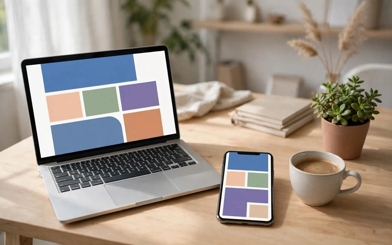
Most visitors meet your website on a phone. We design for the smallest screen first, then let the layout grow.
Before launch we check every page on three phones, a tablet and two laptops: type sizes, tap targets, image crops and how fast it loads on a slow connection.